San Francisco International Airport- Part 1
San Francisco Airport passenger data visualization for year 2005 to 2015
San Francisco International Airport is an international airport 13 miles south of downtown SanFrancisco, California. It has flights to points throughtout North America and is a major gateway to Europe and Asia.
SFO is the largest airport in the San Francisco Bay Area and second busiest in California, after Los Angeles International Airport. In 2013 it was the 7th busiest in US and 21st busiest in the world by passenger count. It is the 5th largest hub for United airlines and functions as United's primary transpacific gateway. It also serves as Virgin America's principal base of operations.
Data for the visualization has been taken from SFO websites
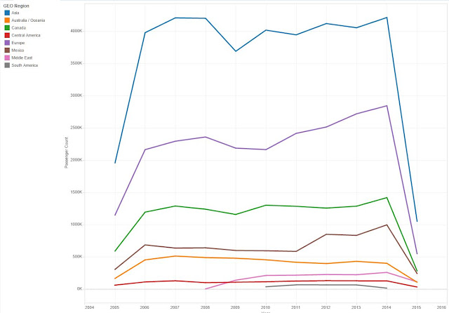
Passenger vs Year
From the above visualization, it is very easy to infer that among international flights, Asia has the maximum number of passenger, even double from the number of passengers from Europe which is almost half of Asia.
In contrast, it could be analysed from graph that passengers from South America is least.
Airline vs passenger
Above screenshot shows the number of passengers travelling in different flights ( domestic and international) for all years sorted by Geographic region.
It is easily visible that UA has maximum number of passenger among airlines travelling to Asia. However, highest number of passenger in any airlines from SFO is UA airline with domestic passengers. Note: It is not visible in above screenshot but any be visualized from link given in the end.
Moreover, many information can be grasped from here such as total type of airlines coming or going from SFO to Oceania/ Australia are only 4.
Domestic vs International
This pie chart shows the passenger count from 2005 to June 2015. It is very obvious that count of domestic passengers are more than 3 times of international. However, for year 2005 and 2006, it was almost 3 times showing increase in international passenger. In the tableau visualization, passenger counts changes according to the year.
Below is the Tableau visualization


0 comments